The Art of Extension
As London’s venerable Victoria & Albert museum unveils an innovative extension, English architect Andrew Major looks at the architectural challenges of accommodating the growing demand for gallery space around the world
|
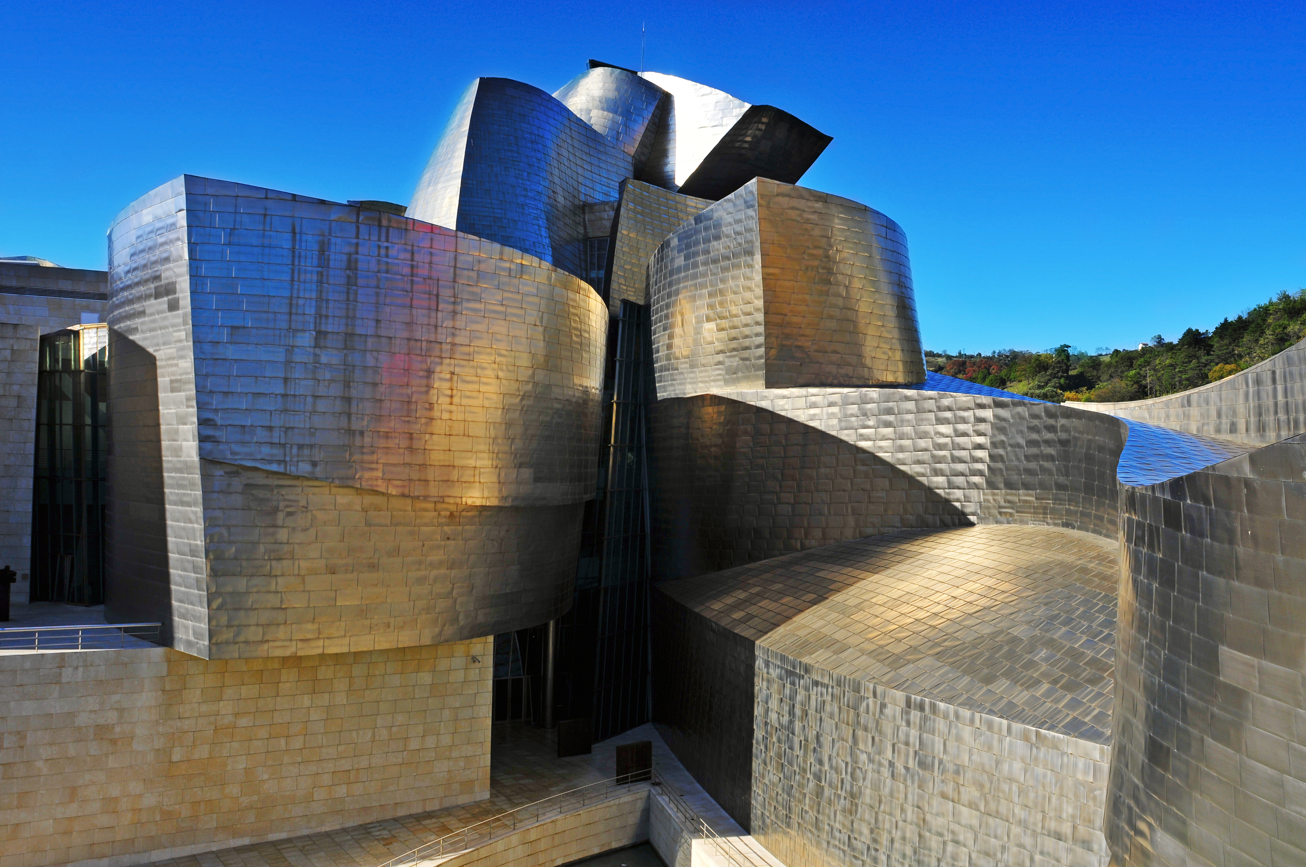
The two requirements of galleries; to be monuments that are by their nature grand and command respect but are at the same time open and attractive, are not always aligned. This is reflected in a growing architectural disconnect between the pressure to design iconic new art galleries as cultural attractors and the museum as a repository of memory. Gehry’s Bilbao Guggenheim, while it acts as the social and economic focal point of a city and allows it to function in a competitive global economy, cannot be said to have the gravitas of existing national museums. The last two decades of the twentieth century in particular saw pressure on space from growing collections and visitor numbers resulting in an explosion of new gallery space. But rather than build from new, there has been a growth in collections around the world looking instead to extend or convert an existing building, and it is possible now to judge their success. |
Possibly the most successful intervention in an existing building is the restoration and conversion of Carlo Rossi’s 1820 neoclassical General Staff Building in St. Petersburg. In the 1900s two Moscow art collectors, Serge Schukin and Ivan Morosov were buying Impressionist and post-Impressionist paintings in Paris. More remarkably they were also buying Fauvist and Cubist paintings and amassed a huge collection. Morosov commissioned two masterpieces from Matisse; Dance and Music. Appropriated by the Soviets after the revolution the collections have always been a misfit in the Hermitage Museum building. Studio 44 Architects have created a gallery for the Hermitage in the General Staff Building for 19th and 20th century art. In this respect it resembles the Musee d’Orsay that was crafted out of a disused railway station. While the restoration and conversion has respected the historic character the architects have developed a distinctive contemporary vocabulary for the interventions. Although the principle façade is semicircular the architects have ingeniously created a grand enfilade on an axis the length of the building. This runs through five internal courtyards now roofed over with glass. The transverse blocks between them have been converted into exhibition spaces and the whole linked by enormous doors. At the same time the mosaic of cellular rooms from its previous use have been retained. In doing this they have simultaneously provided all the requirements of a modern gallery while retaining the historic culture of St Petersburg. |
|
|
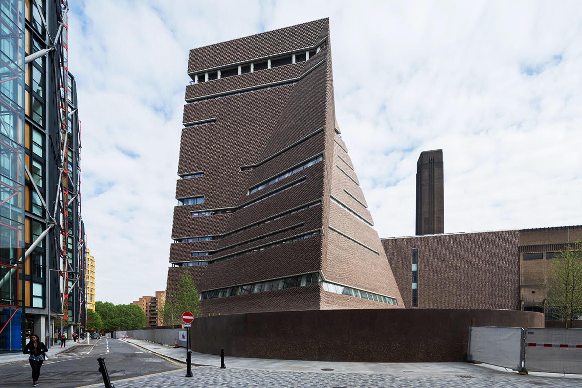
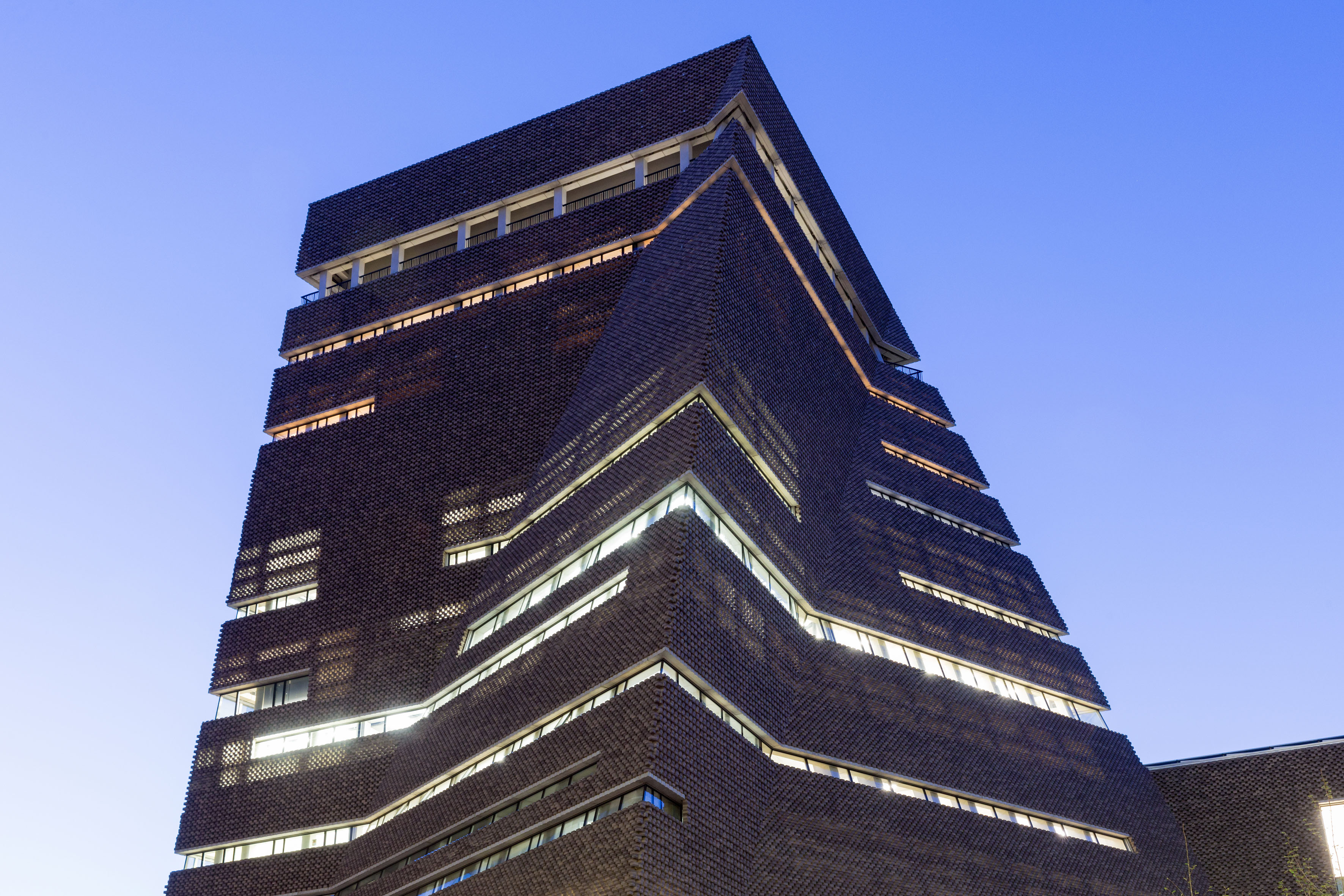
The equivalent London gallery is Tate Modern. In 1994 a then little known practice, Herzog and de Meuron, won a competition to convert a disused power station into a new art gallery to house the Tate’s modern art collection. Although alternative sites closer to the existing South Bank Arts Centre were proposed for the new gallery, the project was to be the single-minded creation of the Director, Nicholas Serota. Designed by Sir Giles Gilbert Scott, grandson of the great Victorian gothicist, the massive brick building with its single chimney dominates that bank of the Thames. The architects were able to draw on the rawness of the industrial aesthetic as a memory of the original use. The genius of the design was to keep the cavernous turbine hall, stripped of its machinery, as an empty space that artists would be challenged to fill with temporary installations. Olafur Eliasson responded most memorably by doubling the height of the hall with a reflective ceiling and creating a vast golden sun at one end. Such was the impact that enchanted visitors would lie down on the hall floor gazing upwards. Designed to accommodate 2 million visitors, in 2000, the year that it opened, there were 5.25 million visitors to Tate Modern, more than twice the number that had visited all three of the existing Tate galleries the previous year. But keeping the hall as a great void means galleries were restricted to the floors on the river frontage and once again there was pressure to create more space. |
The gallery first extended into three vast underground concrete oil tanks. Devoid of natural light they allow complete control over the environment. However the raw and marked concrete walls dominate, as is currently the case with an installation in one tank consisting solely of concrete balls connected by ropes. A second darkened tank currently contains a circle of forty speakers, each one individually relaying one of the forty voices of a choir singing a forty-part motet by the sixteenth century composer Thomas Tallis, with stunning effect. It was clear from the numbers gathered within the ring of speakers which artist had the greater appeal. Having taken possession of the underground tanks Herzog and de Meuron were then commissioned to design an extension. This scheme pays little reference to context. It consists of a squat and truncated pyramidal tower built over the tanks and rising above the turbine hall, consequently visible from across the river, with a sloping façade of latticework brick. With no rational derivation the pyramidal form creates vast internal circulation spaces and meandering stairs. The actual galleries are conventional and somewhat uninspiring spaces sandwiched between the pyramid and the turbine hall. The upper levels contain education and office spaces that are squeezed to fit the building’s awkward geometries. More column inches have been printed about the fact there is a viewing gallery on the top level that allows visitors to look straight into the adjacent glass walled flats designed by Richard Rogers, than any of the exhibitions in the building. Herzog and de Meuron had long ago achieved the status of ‘starchitect’ and their aim was to create a distinctive but self-consciously iconic building. The Tate Modern extension is a distinctive design in a style that is the result of original thinking by the architects and a reflection of the period. |
|
|
An earlier project to extend a London gallery failed due to stylistic preconceptions and prejudices. A competition with 79 entries for the design of the Sainsbury Wing, an extension to the National Gallery in Trafalgar Square, was won by architectural practice Ahrens Burton and Koralek. Known for their High-Tech style their design nevertheless presented a restrained modernist elevation to Trafalgar Square in scale with the existing façade. At a dinner to celebrate the 150th anniversary of the Royal Institute of British Architects Prince Charles described the design as “a monstrous carbuncle on the face of a much loved and elegant friend.” Despite the fact that the original elevation of 1832 by William Wilkins is a very weak version of classicsm, even being lampooned and an object of public ridicule at the time, the immediate reaction was loss of nerve and permission to build was refused. Subsequently, a closed competition for a new design held in 1982 was won by American Post-Modernists Robert Venturi and Denise Scott Brown. Designed to house the gallery’s Renaissance paintings, the architects drew inspiration from the top lit galleries of Sir John Soane’s 1817 Dulwich Picture Gallery in south London, a building that has influenced gallery design ever since. The completed Sainsbury Wing is the best example of Post-Modernism in the UK demonstrating that a building can be contextual and neither revivalist or stridently modern. However, in compromising it satisfies neither view and there followed a period of architectural conservatism of neo-Georgian designs when planning committees could be heard to ask ‘would Prince Charles approve?’ |
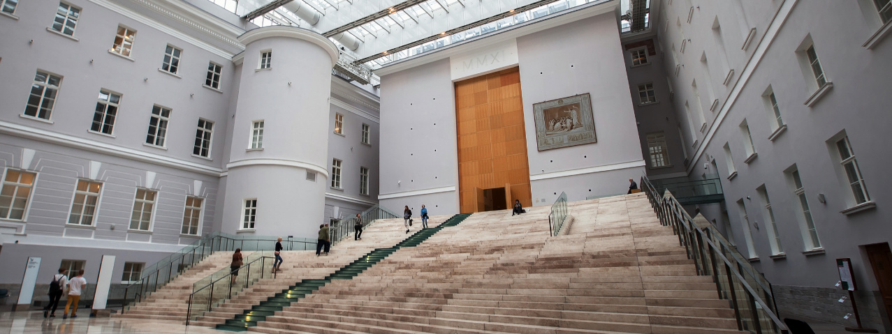
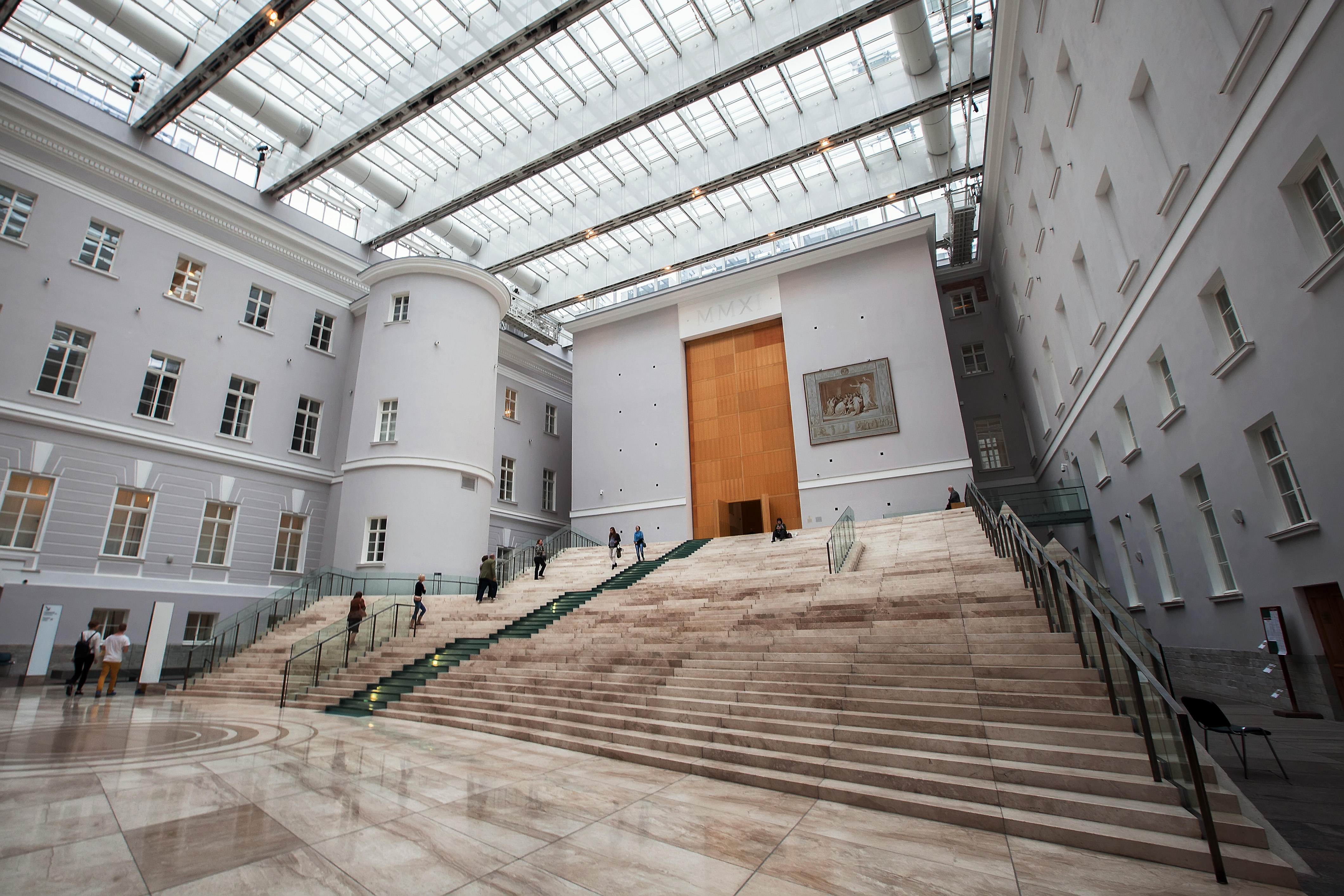
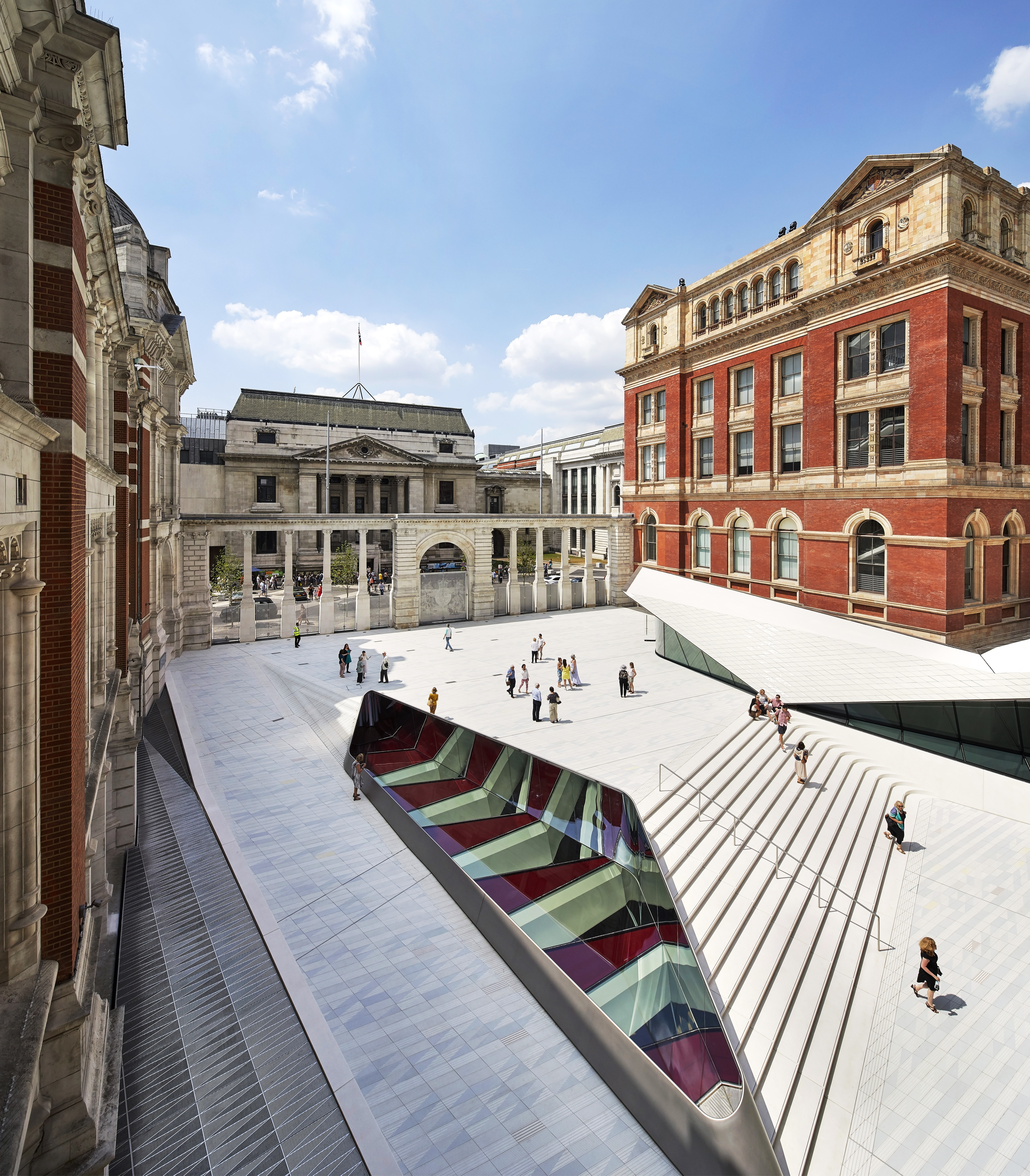
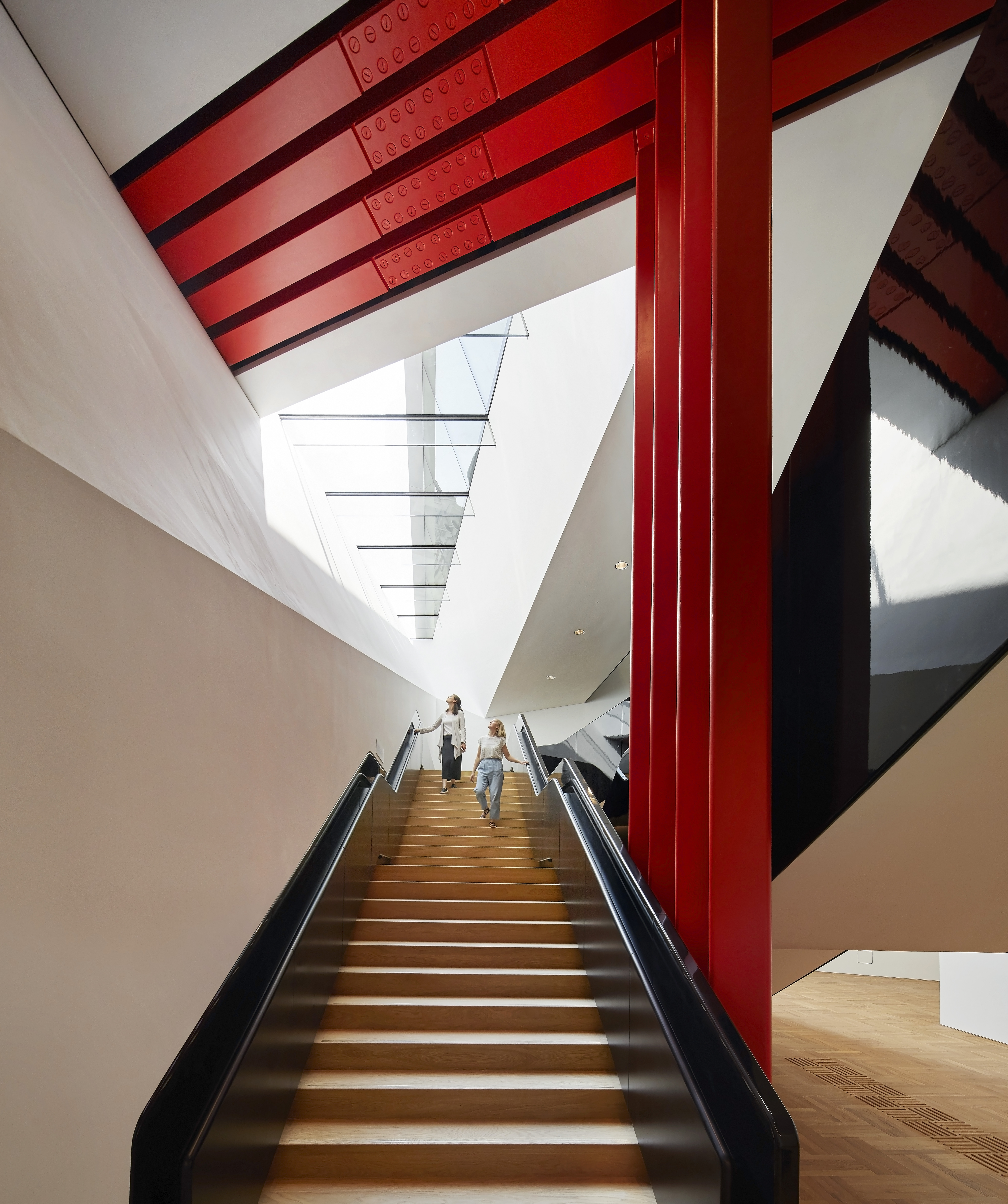
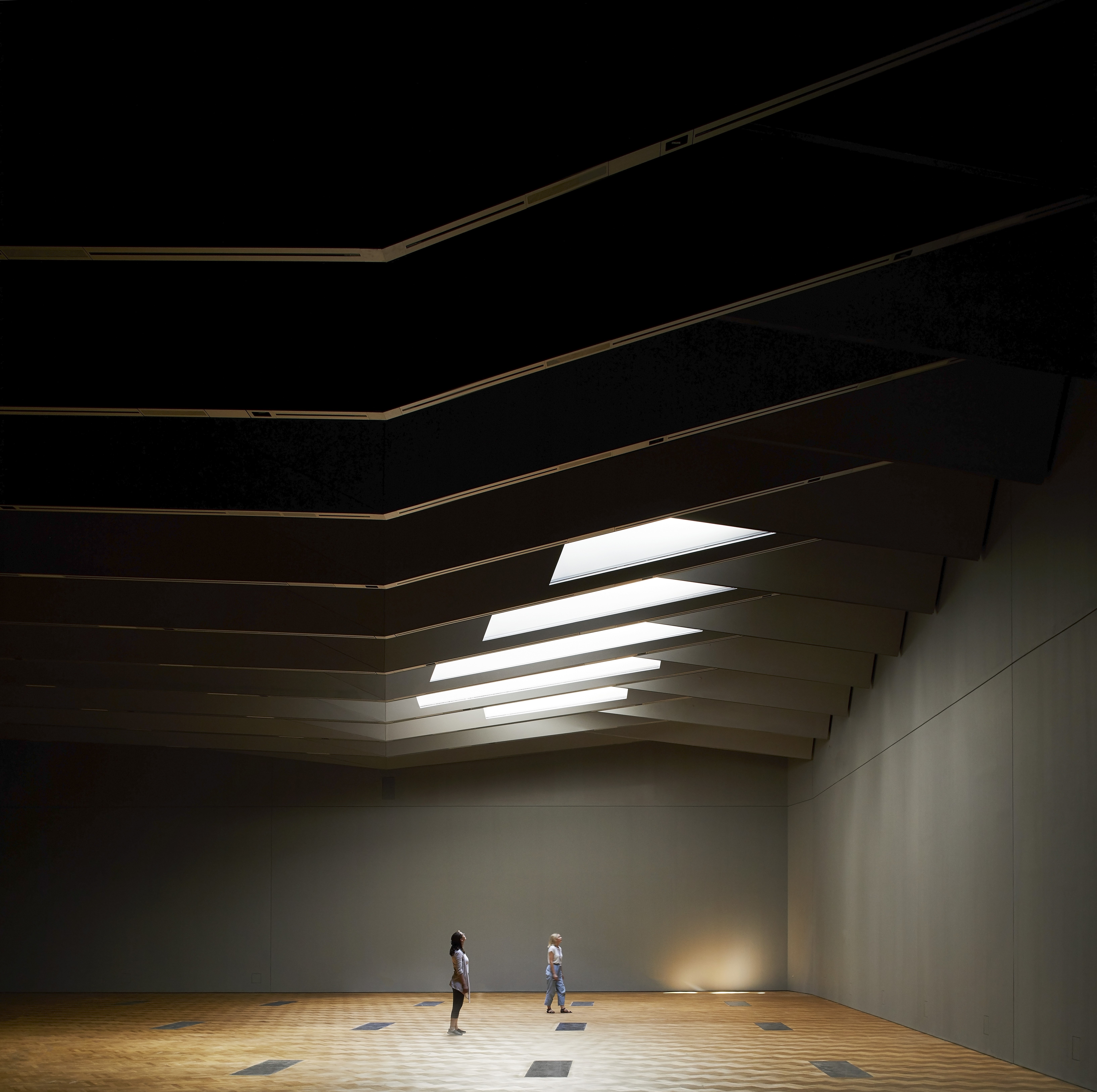
Many London galleries have since used ingenuity to extend their exhibition spaces. For the Royal Academy, Norman Foster opened up a staircase at the rear of the building to give elegant access to an upper level gallery. The National Portrait Gallery traded unused space with the adjacent National Gallery to create a massive two-storey escalator link to upper levels and a top floor restaurant designed by architects Edward Jones and Jeremy Dixon. A newly opened gallery at London’s venerable Victoria and Albert Museum has been built on a site that used to be a service yard. Designed by Amanda Levete Architects, what is striking is that the gallery and the associated back of house facilities are in a cavernous space below ground. A previous design for this site by deconstructivist architect Daniel Libeskind consisting of a tortured, jagged geometric spiral that stood in stark contrast to the 1909 building by Aston Webb, was dropped when it failed to achieve the £100 million needed to fund the project. |
|
|
Although the Levete design is only the subtlest of intervention in the Webb elevations and the Pei pyramid is a grand statement on the axis of the Tuileries, and is now as much a landmark of Paris as the also previously reviled Eiffel Tower, what these schemes have in common is that they have both made monumental buildings that contain a repository of collective memory and history more open and accessible. This seems to be a recurring theme where pre-existing buildings have been extended or adapted, providing the grandeur that commands respect, while at the same time being modern and accessible. |
In its place Levete has retained the site as a light filled courtyard, paved with porcelain tiles broken only by a large oculus lighting the gallery below. The courtyard links the museum to the street, Exhibition Road, which was radically remodelled when the distinction between carriageway and pavement and the associated clutter of road signs was removed, creating a shared surface giving priority to pedestrians. Road and courtyard are separated only by a screen of brick columns, part of the original Webb design. Levete is of course not the first to have gone below ground. While the scheme did not directly create more exhibition space, in 1989 IM Pei linked the three wings of the Louvre in Paris with an underground entrance with access through the famous glass pyramid located in the central courtyard. Initially hugely unpopular, the then Director of the Louvre resigned and up to ninety percent of the population of Paris was said to be against it, saying the plans disfigured the French Renaissance architecture of the Louvre. |
|
Others
Latest News | 1 December 2017
Five cities where ‘tesign’ is creating happiness

Latest News | 1 December 2017
Happiness: a ‘Tesign’ for life

Latest News | 1 December 2017
AI Centaurs

Latest News | 1 December 2017
3 1/2 problems for digital assistants

Latest News | 1 December 2017
Designing an AI that Cares
Latest News | 1 December 2017
Space to Breathe

Latest News | 1 December 2017
When Big Data Gets Too Big

Latest News | 1 December 2017
Hong Kong’s homegrown zombie invasion