Look: The Graphic Language of Henry Steiner
|
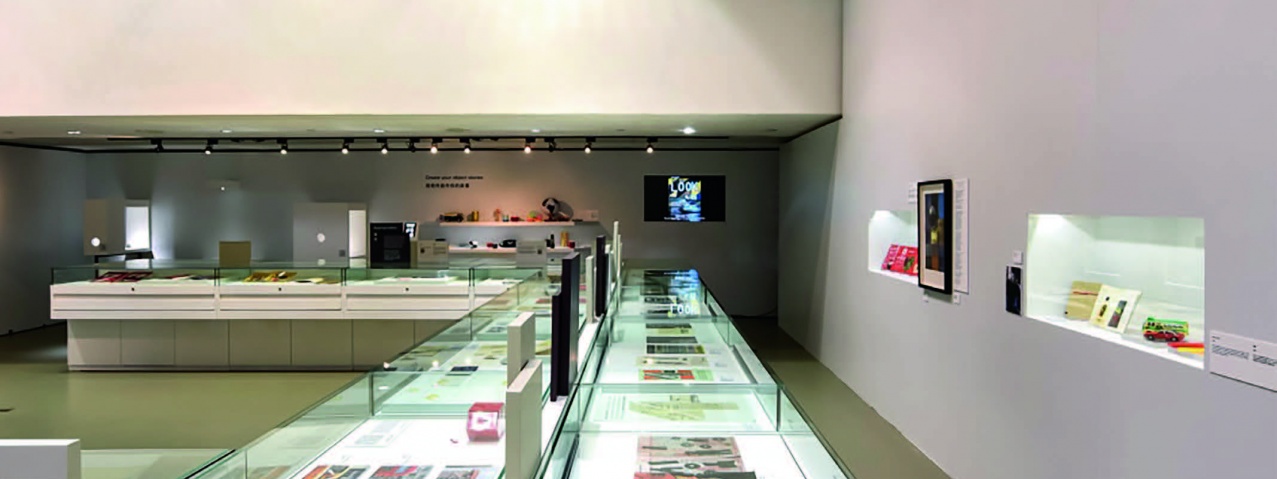
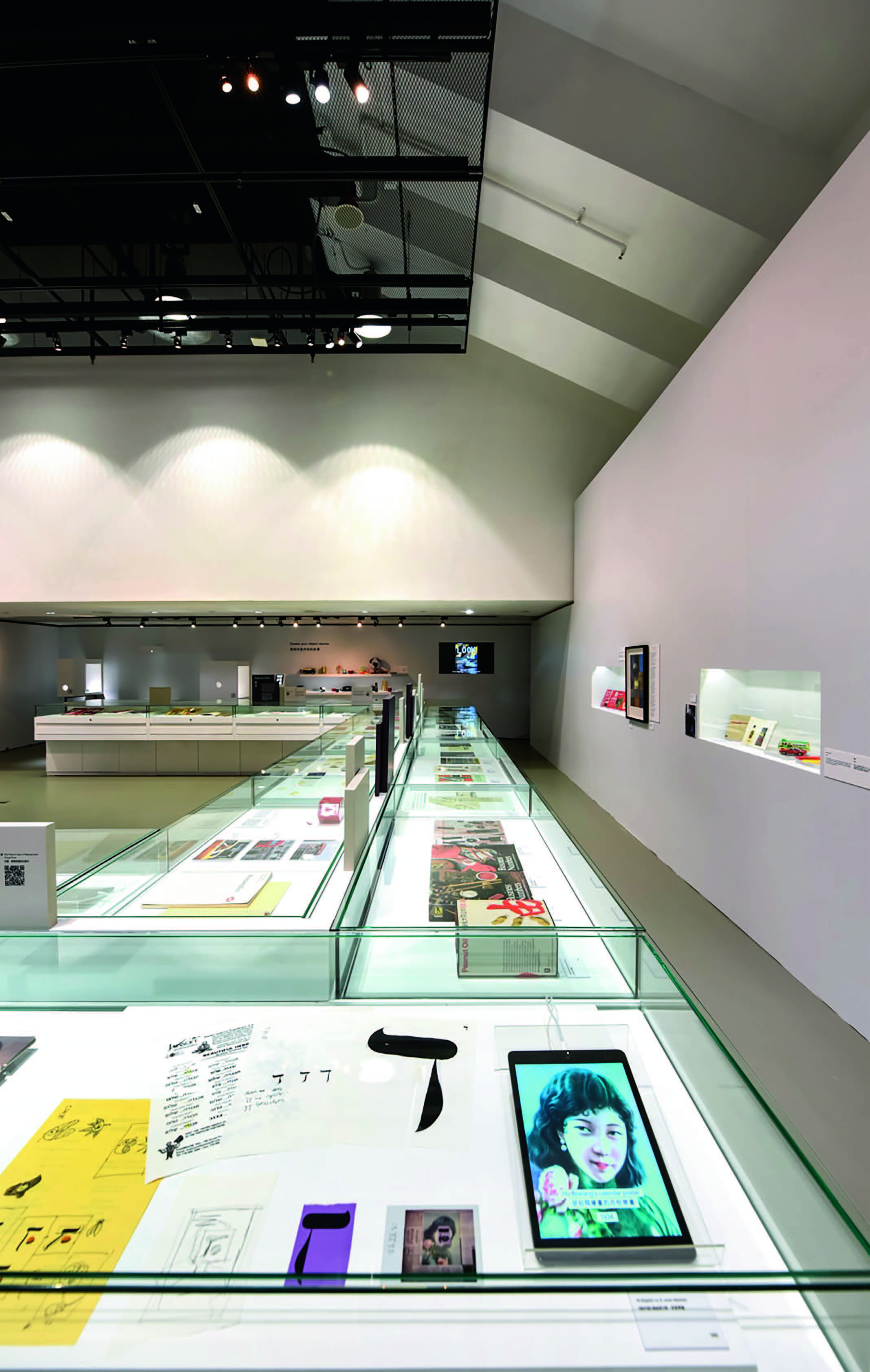
The Hong Kong Design Institute (HKDI) and the Hong Kong Institute of Vocational Education (IVE) (Lee Wai Lee) present "Look: The Graphic Language of Henry Steiner" exhibition at the HKDI Gallery, showcasing the iconic works created by renowned designer Henry Steiner. Austria-born designer Henry Steiner has been calling Hong Kong his home since 1961. For decades, Steiner worked on the frontier of transforming Hong Kong's visual culture. His exceptional creative skills and precise understanding of the local culture made him the designer of choice for numerous industry-leading corporations and conglomerates in Hong Kong, including HSBC, Hong Kong Jockey Club and Standard Chartered Bank. As a designer, Steiner possesses a diverse portfolio, ranging from logo designs to print and banknote designs. Widely recognized as "the Father of Hong Kong Design", with a unique eye for local visual elements, he has opened up new realms for graphic design that continues to contribute to Hong Kong's visual culture in transformative way. Curated by the HKDI Department of Communication Design, "Look: The Graphic Language of Henry Steiner" offers a retrospective journey into the fascinating works of Henry Steiner in the past 60 years and explores how they have represented the roots of brand image of Hong Kong's prominent corporations. "The exhibition has one key takeaway: graphic design is a language," says Henry Steiner, "Unlike 'seeing', 'looking' is an active quest for solutions." Divided into five areas, the exhibition navigates visitors through the different layers of Steiner's visual language: Symbols, Contrast, Stories, Appropriation and Systems. Steiner believes that we become aware of the visual elements around us only when we are mindful of looking. In the exhibition, elements we are largely exposed to on both social media and in print media intertwine. Shapes, graphics, texts and colours all come together and become one visual language. The exhibition prompts visitors to look for the meaning and messages designers aim to communicate behind their creations. "It is our honour to have Mr Steiner, the Father of Hong Kong Design, to launch his exhibition in Hong Kong at the HKDI Gallery," says Dr Lay Lian Ong, Principal of HKDI & IVE (Lee Wai Lee). "We hope that this exhibition offers design students, designers and the public a lens into Steiner's creative journey in graphic design across different times, drawing focus and inspiration to local design and its overall development." Exhibition Area 1: Symbols A fundamental element of graphic design, symbols are powerful in holding multilayered meanings. As Steiner puts it, one must observe closely in order to discover visual symbols and their meanings in the surroundings. His approach to symbols is most apparent from the 1960s to the 1990s when the financial industry was rapidly on the rise. Steiner adopted symbols for corporates looking to build a modern and international identity. Exhibition Area 2: Contrast "What gives life to a design is contrast." says Steiner. Here, the designer showcases his unique perspectives with an eclectic mix of familiar and strange elements. Using montage and split-image to create subtle but noticeable contrasts has been a distinctive style of Steiner. Exhibition Area 3: Stories Steiner believes graphic designs carry stories while designers are the narrators. This section walks visitors through Steiner's process behind visual storytelling. Exhibition Area 4: Appropriation Appropriation might party be borrowing existing visual vocabulary, but it requires designers to have exceptional command of the design language itself. This section showcases Steiner's ability to accurately sample visual vocabularies and in turn create new meanings to existing elements. Exhibition Area 5: Systems Design is a creative field, but the rigid systems present in design are equally important. In this section, visitors see the deep understanding the designer has for visual structure such as colours, shapes, lines and typography, and how he successfully manipulated these elements in order to bring about effective, appealing and coherent designs. |
Others
Latest News | 16 July 2021
2nd Hong Kong Denim Festival
Latest News | 16 July 2021
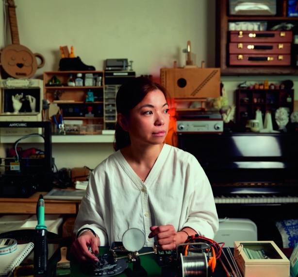
Dai Fujiwara: The Road of My Cyber Physical Hands
Latest News | 16 July 2021
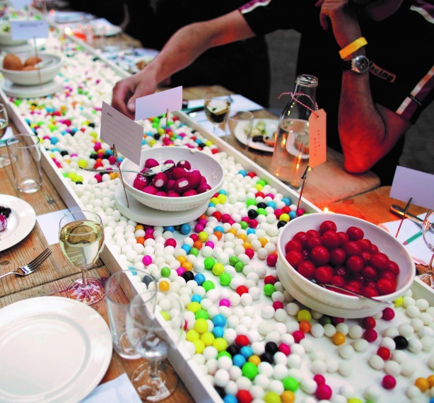
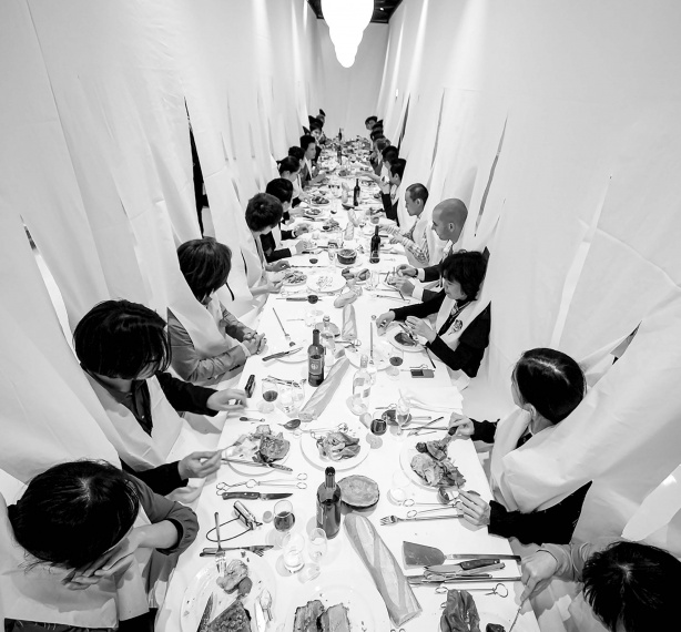
Rethinking the Everyday: Food Non Food
Latest News | 16 July 2021
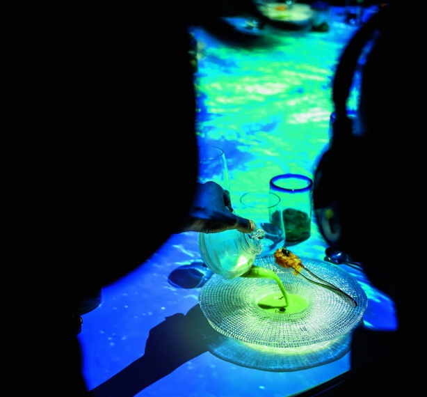
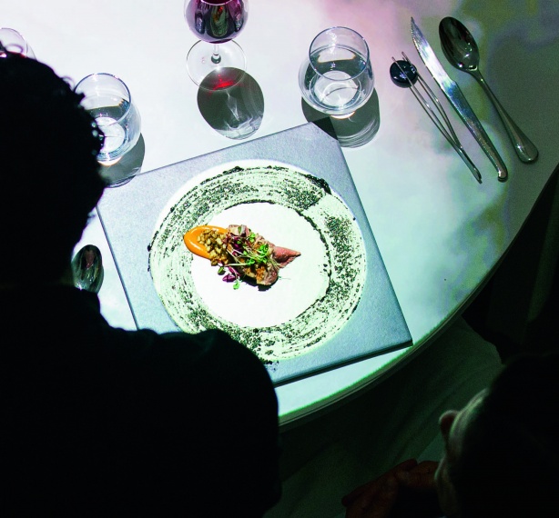
Food + Imagination = A Recipe For Change
Latest News | 16 July 2021
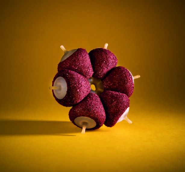
Future Fruit Inspired by the Original

Latest News | 16 July 2021
The Peel-to-Cup Orange Juice Bar
Latest News | 16 July 2021
The Multi - Sensory Language of Life
Latest News | 16 July 2021
Re-thinking Food's Future
Latest News | 16 July 2021
The Moon is Leaving Us: A Scientific Exploration of the Arts
Latest News | 16 July 2021
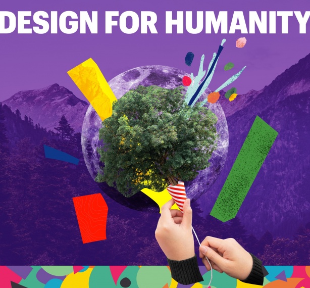
Emerging Design Talents 2021 : DESIGN FOR HUMANITY