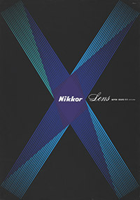
Yusaku Kamekura
Nikkor lens (1960) |
Entering the Modern Era
Japan’s rapid development after 1950 into a leading economic power and consumer society meant that a new kind of visual communication was needed. First-generation graphic designers such as Yusaku Kamekura took their cue from the modernist style in the West, and displayed a rational, universally comprehensible approach, a reduction in shapes and colours, as well as the use of Latin writing in their works. |
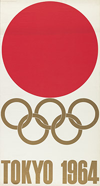
Yusaku Kamekura
Tokyo 1964 (1964) |
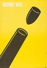
A Geometric Vocabulary of Forms
An inclination toward non-perspectival, two-dimensional renderings and a penchant for formal and functional abstraction still mark Japanese vernacular design today — elements that can be traced back to the historically important genre of the woodcut. Variations on the circle found in poster art can also be seen as part of this tradition. A prime example is Yusaku Kamekura’s poster for the 1964 Summer Olympics in Tokyo. |
 |
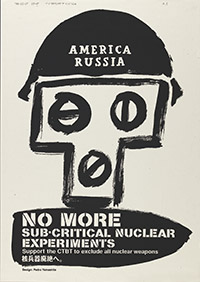
Pedro Yamashita
America / Russia / No more sub-critical nuclear experiments (1998) |
The Expressive Power of Line
The Japanese woodcut — ukiyo-e — was discovered and enthusiastically received by the West after the economic opening of Japan in 1854. It influenced artists at the turn of the 19th century, giving birth to a stylistic mode known as Japonism. The technique of woodblock printing makes line and plane the main focus of pictorial composition. As a design element, line sometimes draws strongly on the expressive, realist tradition, but can also be used in a gestural and abstract manner. |
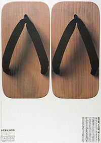
Matsunaga Design Inc. / Shin Matsunaga, Katsumi Yamada, Photo by: Yojiro Adachi
Season (1988) |
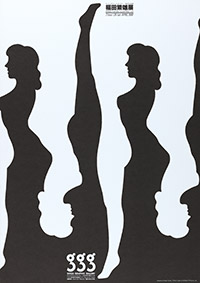
The Idea of a Thing
Concentration on the essentials, on the idea of a thing, shapes Japanese poster design even when concrete motifs are represented. By merely suggesting a subject, the artist leaves the viewer room to interpret what he sees and to charge it with his own meaning. This allows not only for rational understanding but also for the freedom to emotionally access a subject. |
|
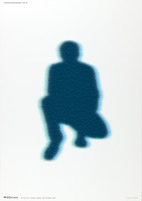
Ken Miki
Wilderness / The place where civilization is forgotten, where man forgets himself. (1993) |
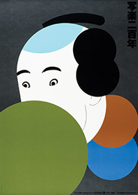
The Filled Void
The metaphysics of emptiness, which is also understood as an expression of silence, is closely linked with Japanese Zen Buddhism. The lacuna is always to be read ambiguously as a space promising opportunities for meditation, concentration, time and peace. Poster design exhibits a self-assured handling of free space and a compelling interplay between pattern and ground. |
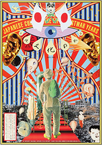
Tadanori Yokoo
Japanese Culture – The Fifty Postwar Years 1945 - 1995 (1995) |
The Intoxication of Colour
The posters of Tadanori Yokoo display an unrestrained delight in resplendent colour, seeming at first to belie the stereotype of Japanese asceticism. Tadanori’s works are typical of a poster culture that ranges between the poles of meditative tranquility and strident provocation. He began in the sixties to defy intellectual concepts in graphic design, and deliberately set out to shock viewers with his imaginative posters, rife with quotations. |
|
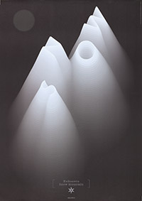
Ken Miki, Shigeyuki Sakaida
Snow / Hokusetu Snow Mountain (ca. 2002) |
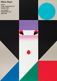
Transparency and Light
Japanese poster designers are masters of the sublime use of colour as a luminous, light-infused material. The vibrant compositions of Mitsuo Katsui, Koichi Sato and Shin Matsunaga open up versatile associations, alluding to psychic and mystical realms. Purification and unity with the universe resonate as additional layers of meaning in these atmospheric mood pictures. |
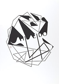
Katsuhiko Shibuya
Shiseido (2012) |
Japanese Posters Today
The trends of the past continue to prevail in the contemporary poster, in which the actual advertising message is still of secondary importance. Instead, it’s all about conveying a specific identity through corporate communications, which in turn derive their impact from the decidedly individualistic touch of the artist/designer. |
|
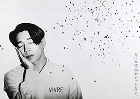
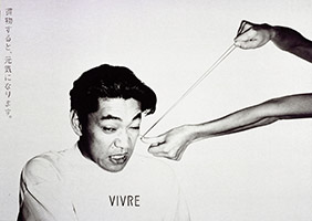
Masami Shimizu
Should I buy something? Vivre (1992) |
Black and White in Dialogue
In Japanese philosophy, black and white form an existential contrast that encompasses all of life: day and night, life and death. A poster style is still widespread today that uses exclusively black and white — a tribute to the calligraphic tradition as well as a conscious rejection of the usual colourful imagery proliferating in the public space. |
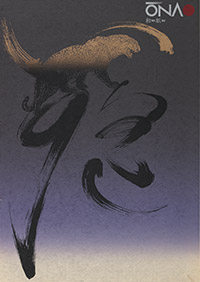
Fumihiko Enokido
Onao / washi (1984) |
A Fascination with Writing
While in the sixties, artists relied on the use of purely Latin script as a way to take part in international modernism, the eighties saw a deliberate reversion to Japan’s own writing tradition. In Fumihiko Enokido’s posters, lively calligraphy gives rise to a lyrical appearance, while today many designers confidently play variations on Latin typography and Japanese characters. |
Masami Shimizu
Shopping cheers you up / Vivre (1992) |